
Fuse

Fuse is a modern communication platform and market data tool for the commercial insurance industry. We worked with the founding team to shape its brand identity and website, from visual direction to messaging, positioning the product as a innovative solution in a conservative space. We then extended the brand to the product.
The logo represents two planes merging into one, illustrating Fuse's role in bridging gaps and uniting diverse parts of the insurance industry. The style is forward thinking yet accessible, underscoring Fuse's commitment to moving the industry into the future while being approachable.
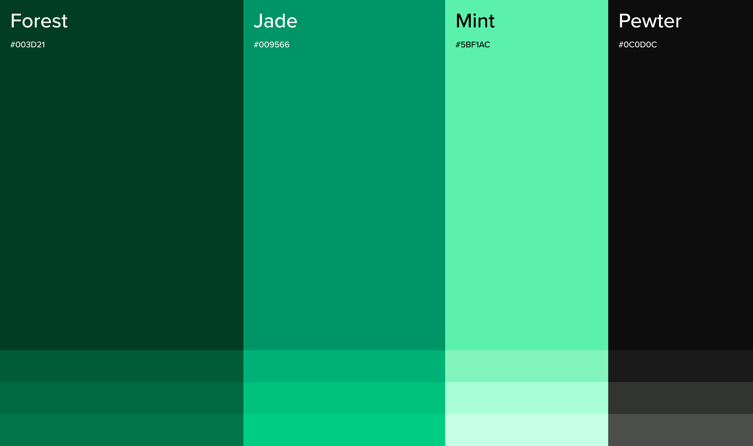
The color palette strikes a balance between modernity and conservatism. Glowing mint signals modernity and innovation, while deeper greens convey trust and stability - supporting the brand’s goal of being both modern and reliable.
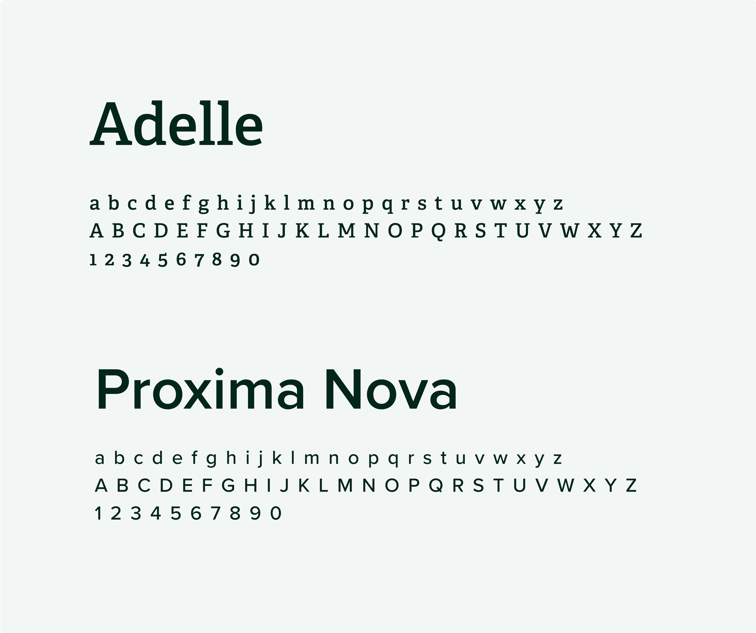
The font pairing creates a balance between trustworthiness and modernity, reflecting the brand's capabilities and authoritative yet accessible nature. This combination ensures a cohesive and efficient user experience, with Adelle's serifed headings providing a sense of stability and Proxima Nova's clean lines promoting clarity and openness.
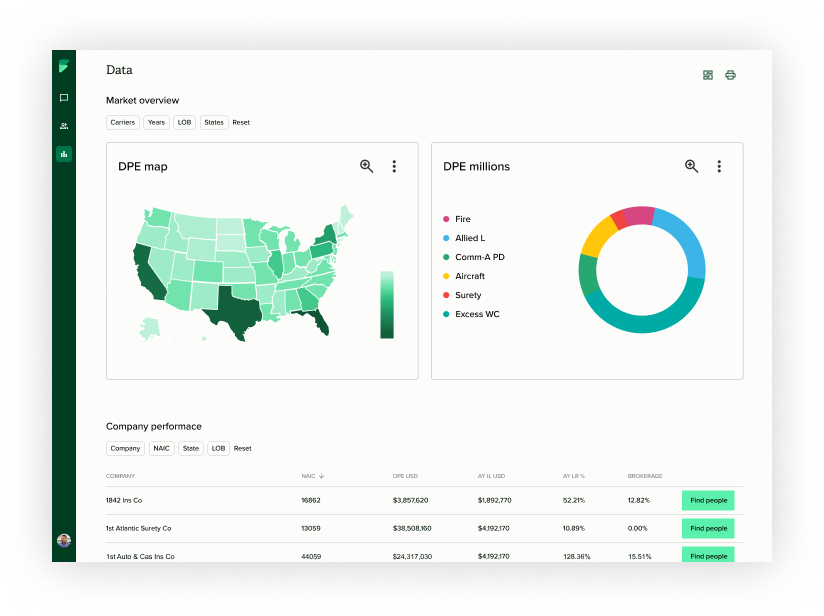
After finalizing the brand direction, we refactored the design system with Tailwind and shad/cn components to align the UI with the new visual identity. This modernization simplified handoff, and created a cohesive brand experience throughout the product.