
Together Health
Brand + Marketing
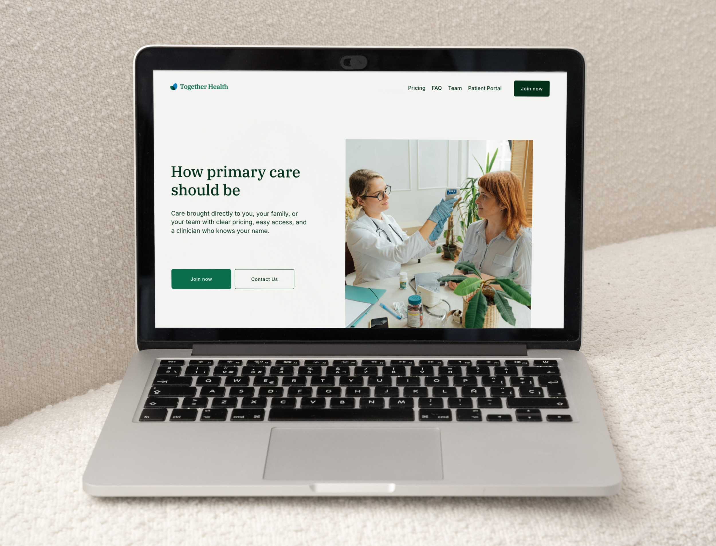
Together Health is a direct primary care practice that makes healthcare feel reliable and human again. By offering longer visits, in-home care, and clear pricing, they give people the kind of attention and transparency that’s often missing in healthcare today. I worked with the founding team to build a brand identity and messaging system that captured this difference. The design emphasizes clarity, trust, and compassion - positioning Together Health as a calm, steady partner for employers and patients alike.
The logo brings two leaf-like forms together, creating a new shape where they overlap symbolizing a visit. This simple gesture reflects what Together Health does best: offering calm attention that brings focus to the person who needs it. The sheer overlap at the center suggests the transparency of their care model.

Emerald is the main brand color, chosen for its reliability. Black Pine reinforces stability, while blue tones adds clarity and lift. Warm neutrals add balance keeping the overall system calm and approachable. The palette overall conveys a healthcare experience that feels steady, clear, and reassuring.

The type system pairs IBM Plex Serif with Inter to create balance in both tone and function. Inter is chosen for its legibility, a quality that cut through the noise of a complicated healthcare system. IBM Plex Serif adds structure and authority, but with a modern edge that keeps it approachable rather than formal. Together they create a voice that is trustworthy, clear, and accessible.
